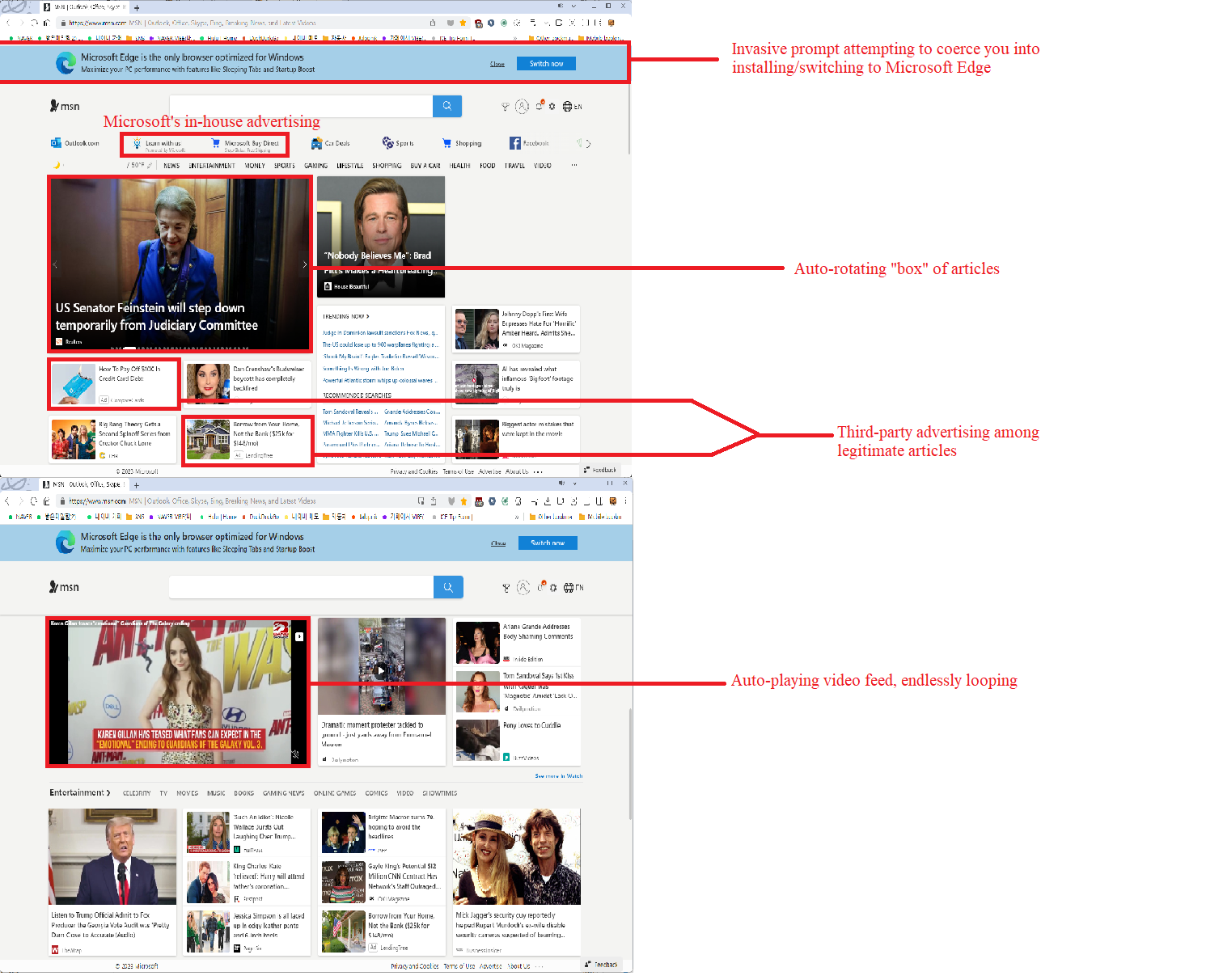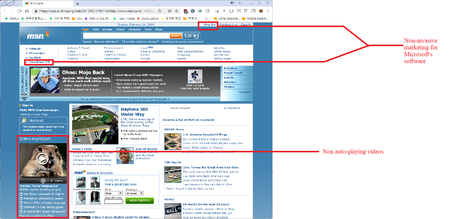
For the unaware, websites have increasingly become more bloated, with advanced (and invasive) scripts, auto-playing content and popups regarding accounts, data retention, and designs meant to "adapt" to both mobile and desktop browsers. For example, this is an archived version of the U.S. version of MSN.com from February 2010, and this is the current U.S. version, which seems to have gained complex scripts and auto-playing videos.


Right-click the images and view them in a new tab/window to view them at full-resolution. They are downscaled to help maintain page viewability.
As you can hopefully see, in this case, MSN's frontpage has gained auto-scrolling images/articles, auto-playing images, and took a noticeable amount of time to load in, especially compared to lightweight webpages, such as the Drudge Report, which maintains a basic and functional frontpage, which (in my experience) does scale excellently to mobile devices; this is part of what has influenced KONAT's design, seeing that KONAT effectively scales to mobile, albiet while lacking most site-side acessibility features, which mostly require the implementation of HTML5 code.

KONAT rendered in Safari on Apple iOS; image courtesy of a reader.
The main driving factor I see is the global shift towards using mobile devices to access the internet, which makes sense, as mobile devices have become more affordable than desktop or laptop computers around the globe, and have helped people in developing countries get online, (worth noting is that as of March 2023, Statcounter reports that ~57.2% of global internet traffic originates from mobile devices, compared with ~40.7% of traffic originating from desktops; on a more localized level, the trend is slightly mirrored in the USA, with desktops barely maintaining a majority share [~54.3% desktop vs ~43.1% mobile], and periodically losing that majority share) therefore, if mobile devices are cheaper than desktops, and data plans become more accessible, then it's reasonable to assume that mobile will inevitably gain market-share. If anything, the rise of mobile browsers has been more of a blessing than a curse, since people of all walks of life can now access information; but in developed markets, it feels almost irritating to have to cater to mobile users, who could just as easily use a desktop for the same tasks.
Another driving factor I've seen is the shift towards template-based webpages, such as those offered by Wix, which tend to be script-heavy, might be dependent on third parties to host content (i.e. Google, Amazon Web Services, Cloudflare, or Akamai), and might also be reliant on embedded content (i.e. YouTube videos and Facebook/Twitter feed widgets) to display certain content, such as videos. While this shift has been good, especially for small business, one has to wonder if the efficiency (for the page creator) advantages outweigh the inefficiency when the end user is viewing the site. Of course, template-based webpages have existed for a long time, as New Zealand-based publisher and businessman Jack Yan pointed out recently, "When I first began blogging as one of the authors of Beyond Branding in 2003, we used Blogger, which wrote to our server in HTML...As the 2000s came to an end and de-Googling was the sensible thing to do (still waiting for the rest of the world to catch up on this one), I looked at Wordpress, which ran on PHP;" the main difference is that the templates aren't meant to run as lean anymore, which I would most likely attribute to both the downfall of personal webpages (in favor of social networking services [SNS]) and the rise in cheaper datacenter hosting (reducing the use of self-hosting on one's own infrastructure.
The final factor (and least bothersome) I've identified in the shift towards worse web design has been the desire for site-side accessiblity. I define"site-side" accessibility as "possible improvements which reduce the need for software on the end-user's device." For example, alt-text, which became mainstream during the 2010s, and allows for screen-readers to read out a (site author provided) description of an image (for example, a photo of a cat laying on a table may have the alt-text "a brown tabby cat laying on a white table, with a red vase on the left side of the cat"); however, alt-text doesn't automatically require bloat, since (in its most basic form) it merely triggers either a read-out in the place of the image or a "flyout" dialog containing the alt-text. The real burden (in my experience) has been the implementation of on-site translation, provided by Google, Microsoft, or another such provider of web-based translation services. I believe that beyond pages that are actually hosted on the site in another language, no "invasive" access to other languages should be included, rather, the end-user should seek translation themselves (for example, if I only speak Spanish in the USA, I should be expected to seek out translations of English-language webpages myself); one main violator I see carrying out this form of bloat is Blackboard, a supplier of websites to many North American educational institutions, who by-default have their sites connect to Google, and directly serve a slow and bloated Google Translate service on their sites. (*Note: Blackboard's "sites" are often utilized by school districts and universities, who may not opt to change any settings from the default template).
Unfortunately, I don't see much of a fix for bloated webpages coming any-time in the near future, especially given that the largest growth in internet users seems to be people in developing markets, who most likely are only able to get online with a smartphone, and do not care about their privacy and freedom at all, as evidenced by their never-ending preference for Facebook's Whatsapp (which while it claims to be end-to-end encrypted, the data is basically a free-for-all for law enforcement to access, (PDF mirrored at KONAT) which is especially an issue in countries like India, Pakistan, and Venezuela, where the people have not en-masse woken up to the issues with their government and the lack of privacy -- but that's a topic for another day); and even in the developed world, people are often unwilling to put up with a less elegant mobile browsing experience, or have to seek out accessibility tools themselves. I think the best thing that can be done is to weigh the risks of any potential backlash in not offering such bloat natively on the site.
Copyright 2023, Econobox_ (d.b.a konat.neocities.org)